


REPHIKE: “Find your people.”
CHALLENGE: RepHike, a vibrant new company with a dynamic team of founders based in Buffalo, NY, was all about helping brands connect with the right micro-influencers and manage their campaigns. The micro-influencer space is still fresh but already overflowing with companies that all seem to blend together. The founders wanted us to revamp their brand and make RepHike stand out as a market leader, not just another face in the crowd.
SUCCESS: We dove deep into the world of micro-influencers and crafted a fresh, standout personality for RepHike that really set it apart from the rest of the many players in the field. The new brand design and direction worked as planned, and it wasn’t long before RepHike was snapped up and acquired by the parent company of Tap Root Fields CBD right after the relaunch.
SERVICES:
• Brand strategy
• Visual identity
• Website (art direction)
• Investor deck (art direction)
• Print (art direction)

The more we dug into the competition and got to know the world of micro-influencers, the clearer it became what needed to be done. Most competitors are all about flashy colors, tech jargon, data obsession, digital illustrations, and generic fonts. They all blend together and treat micro-influencers like just another data point for the brand’s bottom line.
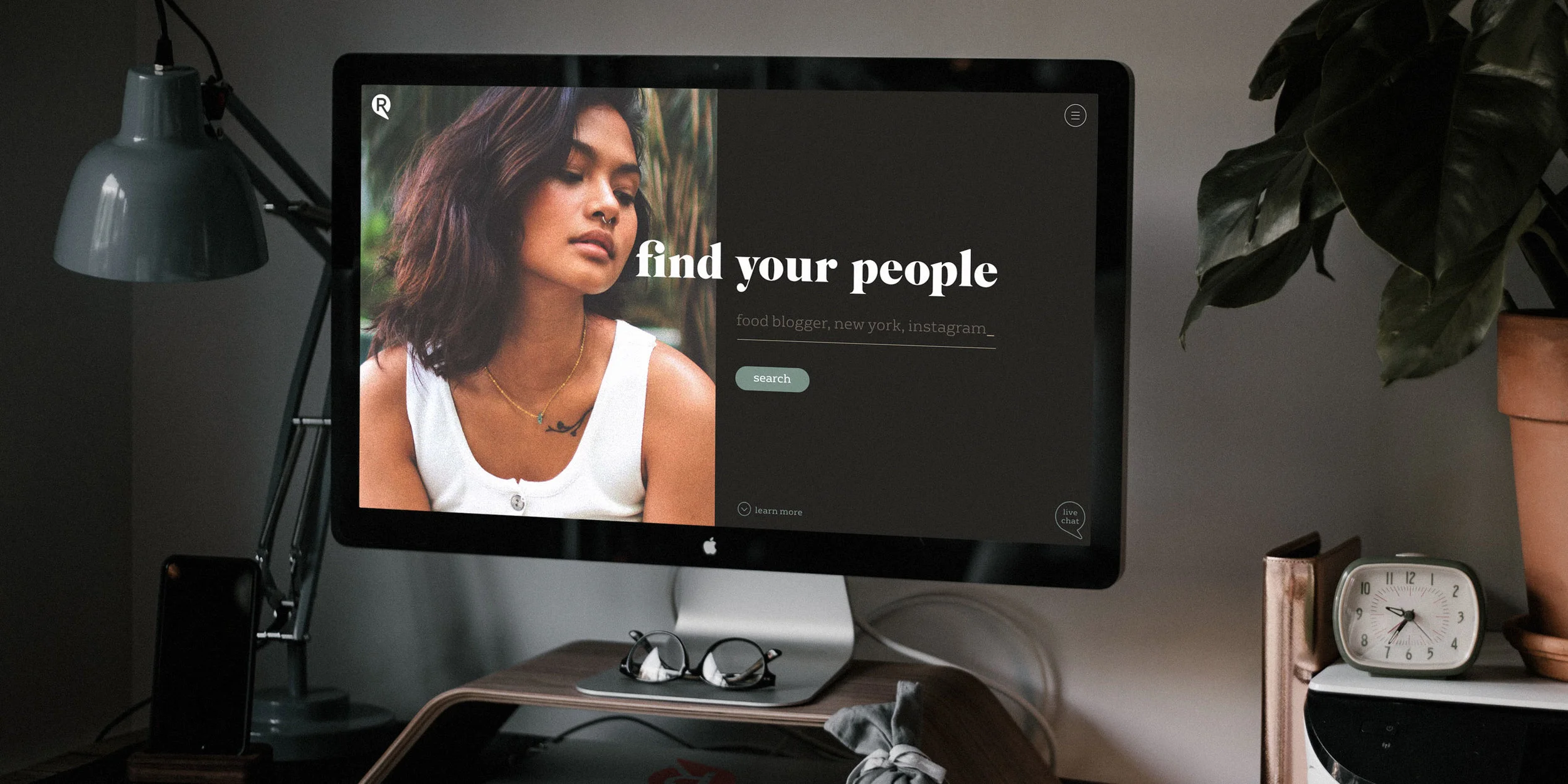
We saw a chance to break the mould. Instead of following the crowd, we gave RepHike a brand identity with a natural color palette, straightforward language, and a focus on real people. We used genuine photography and fonts that have character and warmth. The new brand message - "Find Your People." - took center stage, while the name RepHike stepped into the background. We steered clear of the term "micro-influencer" and talked about "people" or "creators" instead.

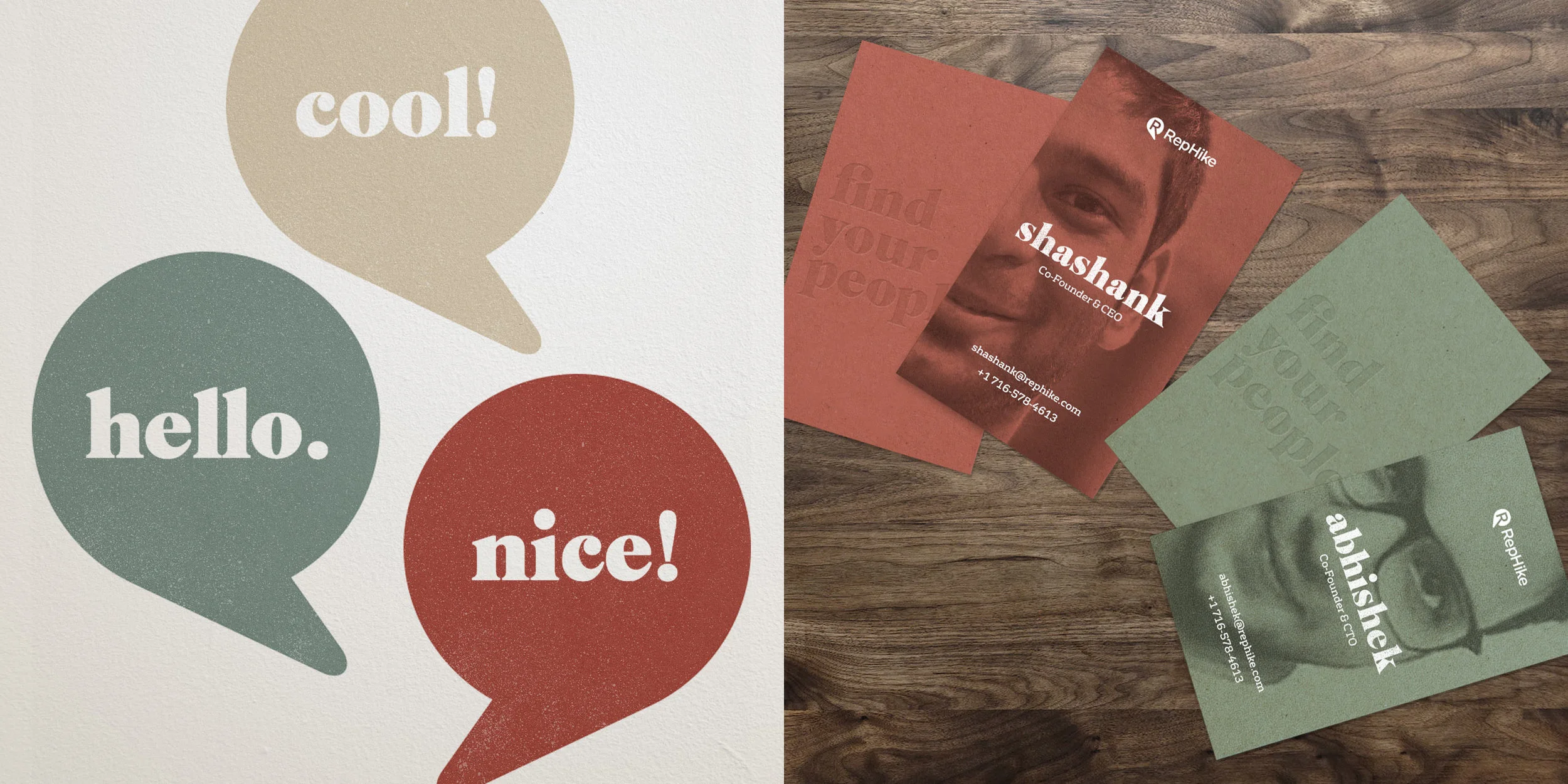
Even though the focus was on people, the name RepHike needed to stick around. We gave the logo a fresh update that fit seamlessly with the new brand look without stealing the spotlight from the photography or the "Find Your People." message. We went for something sleek and minimal—an "R" from RepHike that subtly blends into a speech bubble, creating a simple yet elegant logo that hints at conversation without being over-the-top.
The old logo, with its flashy colors and gradients, was just another face in the crowd and had a shape that was way too complicated. Plus, the typeface mixed rounded and sharp edges in a way that just didn’t work. We cleaned it all up with a modern, straightforward sans-serif font that felt right at home with the new look.
Before:


REPHIKE UPDATE JAN 2025: The brand was acquired by the parent company of Tap Root Fields CBD right after the relaunch.